Pride: Expanding the Rainbow
Pride Toronto is a non-profit organization that brings people together to celebrate the history, courage and diversity of the LGBTQ2S+ community.
Uniting and empowering people with diverse sexual orientations, gender identities and gender expressions, the annual Pride Toronto festival has become a major arts and culture event and the largest Pride celebration in North America.


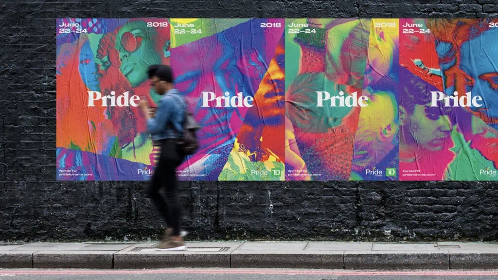
For the 2018 Pride Toronto festival, BMD created a visual identity system that evolved beyond the slogan-driven approach of previous years, avoided the tropes of Pride festival branding, and honoured 35 years of AIDS Activism. The identity system features members of the local community, pairing archival imagery with newer photography. The jagged rips reference the homemade signs of early activism. The color palette is “post-rainbow” representing all identities within the LGBTQ2S+ community. Contemporary yet nostalgic typography looks both to the past and the present.


The identity system features members of the local community, pairing archival imagery with newer photography.
BMD rolled the system out extensively to web, social, video, print, events, fundraising and out of home across the city. Carefully balancing vibrancy and vigor, the visual identity is rooted in the history of queerness and looks forward to a future celebrating inclusiveness.
The identity was used nationally and internationally to drive attendance, celebrate the community, secure sponsorship and cement Pride Toronto’s position as a leading global festival.


